Conversion Killers: 5 UX Flaws That Drain B2B ROI

04 Feb 2026
by Nadiy, Senior Content Writer
04 Feb 2026
by Nadiy, Senior Content Writer
Conversion Killers: 5 UX Flaws That Drain B2B ROI
Table of contents
Contact us
We will get back to you in the next 48 hours.

Conversion Killers 5 UX Flaws That Drain B2B ROI
Are subtle UX flaws quietly draining your B2B ROI? Learn how overcomplicated navigation, slow pages, unclear CTAs, and more could be costing you leads—and what you can do to fix them.
In the B2B world, every click, form submission, and interaction has a direct impact on your bottom line. Yet, many businesses unknowingly lose revenue due to subtle user experience (UX) flaws.
While your product or service might be exceptional, the way users engage with your digital platform can make or break conversions.
Understanding and fixing these conversion killers is essential to maximize ROI and build lasting relationships with your clients.
Want to find out how much it costs to build your dream app or web app?

So what are these conversion killers, and why do they matter so much for B2B ROI? Let’s take a look.
1. Overcomplicated Navigation Confuses Visitors
For enterprise buyers, navigation isn’t about exploration—it’s about efficiency. Stakeholders arrive with clear intent: assess credibility, validate capabilities, and determine fit. When navigation is cluttered, overly layered, or filled with internal jargon, it slows decision-making and increases friction at the very first touchpoint.
Studies consistently show that users abandon websites when they can’t find what they need quickly. In B2B environments, this isn’t just a usability issue—it’s a trust issue. If your platform feels difficult to navigate, it signals operational complexity and lack of clarity, both of which raise red flags for enterprise decision-makers.
In B2B environments, where buying cycles are already complex, unnecessary cognitive load quickly erodes trust and momentum.
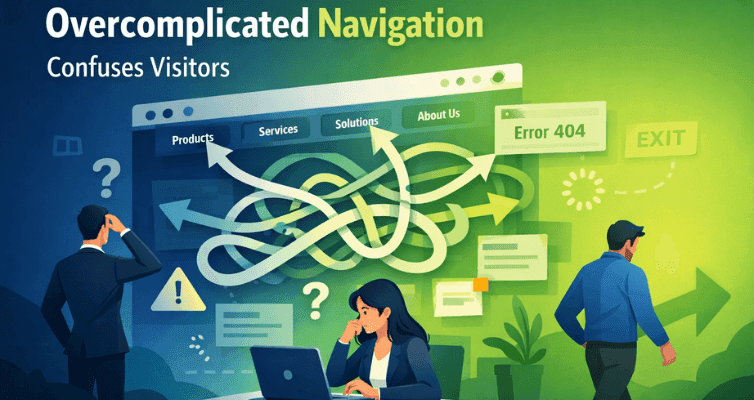
How it impacts ROI: Every second of hesitation reduces the likelihood of conversion. Research shows that users form impressions about usability in under two seconds. Confusing navigation can turn interested prospects into lost opportunities.
Solution: Streamline menus, use clear categories, and ensure important content is accessible within two to three clicks. Interactive site maps and intuitive search functions can also help visitors find what they need faster.
Simplified, intent-driven navigation accelerates evaluation and reduces drop-off. By helping users reach key information quickly, businesses shorten decision cycles and improve conversion efficiency across the funnel.
2. Slow Loading Speeds Kill Engagement
Enterprise users expect performance. Page speed is often subconsciously associated with reliability, scalability, and technical maturity. When pages load slowly, users don’t just disengage—they question whether the underlying systems can support enterprise-level demands.
Data shows that even small delays significantly increase bounce rates, particularly on high-value pages. In B2B, where buyers frequently compare multiple vendors in parallel, slow performance introduces unnecessary risk into the decision process and quietly pushes users toward faster, more seamless alternatives.
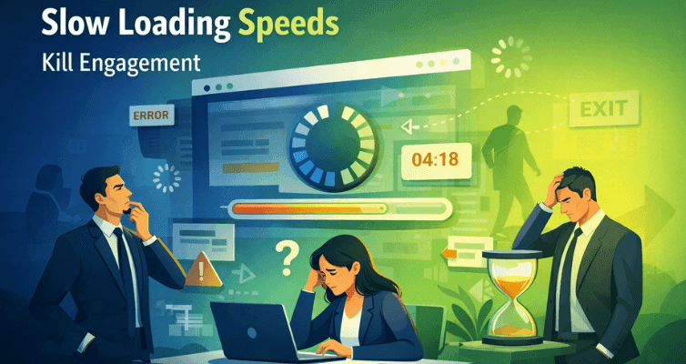
How it impacts ROI: Even a one-second delay in page load can significantly decrease conversions. B2B buyers evaluating multiple vendors may abandon a slow site for a competitor who provides a seamless digital experience.
Solution: Optimize images, leverage browser caching, and minimize unnecessary scripts. Regular speed audits can ensure your platform keeps pace with user expectations.
Optimized performancekeeps enterprise buyers focused on value, not friction. Faster load times reduce abandonment, increase engagement, and protect conversion opportunities at critical evaluation stages.
3. Non-Responsive Design Frustrates Mobile Users
Enterprise decisions rarely happen in a single session or on a single device. Research, validation, and follow-ups often occur across mobile, tablet, and desktop environments. When a platform fails to deliver a consistent experience across devices, it disrupts continuity and weakens confidence.
Poor mobile experiences are often interpreted as a lack of foresight or scalability—especially when key interactions like reading case studies or completing forms become difficult. Even if conversions happen later on desktop, early friction can influence vendor shortlists long before formal discussions begin.

How it impacts ROI: A poor mobile experience can directly reduce lead generation and engagement. Users are less likely to complete forms or explore offerings when content isn’t optimized for their device.
Solution: Implement responsive design best practices. Test layouts across devices, simplify forms for mobile, and prioritize critical content to ensure smooth, frictionless navigation.
A fully responsive experience ensures consistency and accessibility throughout the buyer journey. By supporting seamless engagement across devices, businesses maintain credibility and keep enterprise prospects moving forward.
4. Ambiguous Calls-to-Action (CTAs) Stall Conversions
Enterprise buyers rarely act impulsively. They move forward when the next step is clear, valuable, and low-risk. Ambiguous CTAs like “Contact Us” or “Submit” fail to communicate intent or outcome, creating hesitation at moments that should drive momentum.
Data consistently shows that clear, value-led CTAs outperform generic ones. In B2B contexts, clarity reduces perceived commitment while reinforcing relevance.
Without it, even highly qualified prospects may pause, delay, or disengage.
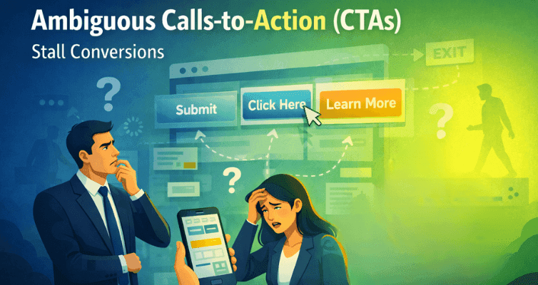
How it impacts ROI: Weak CTAs directly reduce lead generation, demo requests, and purchases. B2B buyers need guidance through complex decision-making processes, and poorly designed CTAs create friction.
Solution: Use action-oriented, benefit-driven language such as “Request Your Custom Demo” or “Download the ROI Guide.” Place CTAs prominently and consistently across high-value pages to guide users effectively.
Strong CTAs provide direction and confidence. When users understand exactly what happens next—and why it’s worth it—conversion paths become clearer, faster, and more effective.
5. Complicated Forms and Data Entry Frustrate Users
Forms are often the final barrier between interest and conversion. In many enterprise platforms, they are overloaded with unnecessary fields, internal terminology, or unclear requirements. This increases perceived effort and introduces friction at the most critical moment.
Research shows that longer forms consistently lead to higher abandonment rates, even among high-intent users. Enterprise buyers are willing to engage—but only when the value exchange feels proportional and respectful of their time.
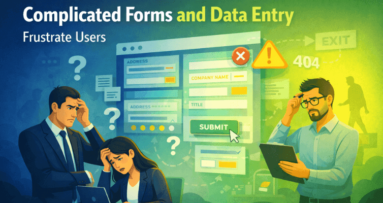
How it impacts ROI: Each abandoned form represents a lost lead and lost revenue opportunity. Complex processes can make your business appear inefficient, even if your offerings are superior.
Solution: Limit required fields to essentials, use smart defaults, and employ inline validation. Multi-step forms with progress indicators can also reduce perceived effort and increase completion rates.
Streamlined forms reduce friction and increase lead quality. By simplifying data capture and aligning it with user intent, businesses improve completion rates and ensure fewer opportunities are lost at the final step.
How Lizard Global Helps Fix UX Flaws and Boost ROI
Addressing these UX flaws can significantly increase your B2B conversions, but it requires expertise and a strategic approach. We, at Lizard Global, work with businesses to identify conversion killers, streamline digital journeys, and create seamless, high-performing platforms.
From responsive design and intuitive navigation to optimized forms and CTAs, we ensure every interaction is tailored to maximize ROI. By combining free UX insights with business strategy, we help companies turn digital experiences into measurable growth.
Ready to create digital experiences your users actually want to use? Work with Lizard Global to design products that remove friction and deliver measurable results.

Conversion Killers 5 UX Flaws That Drain B2B ROI
Are subtle UX flaws quietly draining your B2B ROI? Learn how overcomplicated navigation, slow pages, unclear CTAs, and more could be costing you leads—and what you can do to fix them.
In the B2B world, every click, form submission, and interaction has a direct impact on your bottom line. Yet, many businesses unknowingly lose revenue due to subtle user experience (UX) flaws.
While your product or service might be exceptional, the way users engage with your digital platform can make or break conversions.
Understanding and fixing these conversion killers is essential to maximize ROI and build lasting relationships with your clients.
Want to find out how much it costs to build your dream app or web app?
So what are these conversion killers, and why do they matter so much for B2B ROI? Let’s take a look.
1. Overcomplicated Navigation Confuses Visitors
For enterprise buyers, navigation isn’t about exploration—it’s about efficiency. Stakeholders arrive with clear intent: assess credibility, validate capabilities, and determine fit. When navigation is cluttered, overly layered, or filled with internal jargon, it slows decision-making and increases friction at the very first touchpoint.
Studies consistently show that users abandon websites when they can’t find what they need quickly. In B2B environments, this isn’t just a usability issue—it’s a trust issue. If your platform feels difficult to navigate, it signals operational complexity and lack of clarity, both of which raise red flags for enterprise decision-makers.
In B2B environments, where buying cycles are already complex, unnecessary cognitive load quickly erodes trust and momentum.
How it impacts ROI: Every second of hesitation reduces the likelihood of conversion. Research shows that users form impressions about usability in under two seconds. Confusing navigation can turn interested prospects into lost opportunities.
Solution: Streamline menus, use clear categories, and ensure important content is accessible within two to three clicks. Interactive site maps and intuitive search functions can also help visitors find what they need faster.
Simplified, intent-driven navigation accelerates evaluation and reduces drop-off. By helping users reach key information quickly, businesses shorten decision cycles and improve conversion efficiency across the funnel.
2. Slow Loading Speeds Kill Engagement
Enterprise users expect performance. Page speed is often subconsciously associated with reliability, scalability, and technical maturity. When pages load slowly, users don’t just disengage—they question whether the underlying systems can support enterprise-level demands.
Data shows that even small delays significantly increase bounce rates, particularly on high-value pages. In B2B, where buyers frequently compare multiple vendors in parallel, slow performance introduces unnecessary risk into the decision process and quietly pushes users toward faster, more seamless alternatives.
How it impacts ROI: Even a one-second delay in page load can significantly decrease conversions. B2B buyers evaluating multiple vendors may abandon a slow site for a competitor who provides a seamless digital experience.
Solution: Optimize images, leverage browser caching, and minimize unnecessary scripts. Regular speed audits can ensure your platform keeps pace with user expectations.
Optimized performancekeeps enterprise buyers focused on value, not friction. Faster load times reduce abandonment, increase engagement, and protect conversion opportunities at critical evaluation stages.
3. Non-Responsive Design Frustrates Mobile Users
Enterprise decisions rarely happen in a single session or on a single device. Research, validation, and follow-ups often occur across mobile, tablet, and desktop environments. When a platform fails to deliver a consistent experience across devices, it disrupts continuity and weakens confidence.
Poor mobile experiences are often interpreted as a lack of foresight or scalability—especially when key interactions like reading case studies or completing forms become difficult. Even if conversions happen later on desktop, early friction can influence vendor shortlists long before formal discussions begin.
How it impacts ROI: A poor mobile experience can directly reduce lead generation and engagement. Users are less likely to complete forms or explore offerings when content isn’t optimized for their device.
Solution: Implement responsive design best practices. Test layouts across devices, simplify forms for mobile, and prioritize critical content to ensure smooth, frictionless navigation.
A fully responsive experience ensures consistency and accessibility throughout the buyer journey. By supporting seamless engagement across devices, businesses maintain credibility and keep enterprise prospects moving forward.
4. Ambiguous Calls-to-Action (CTAs) Stall Conversions
Enterprise buyers rarely act impulsively. They move forward when the next step is clear, valuable, and low-risk. Ambiguous CTAs like “Contact Us” or “Submit” fail to communicate intent or outcome, creating hesitation at moments that should drive momentum.
Data consistently shows that clear, value-led CTAs outperform generic ones. In B2B contexts, clarity reduces perceived commitment while reinforcing relevance.
Without it, even highly qualified prospects may pause, delay, or disengage.
How it impacts ROI: Weak CTAs directly reduce lead generation, demo requests, and purchases. B2B buyers need guidance through complex decision-making processes, and poorly designed CTAs create friction.
Solution: Use action-oriented, benefit-driven language such as “Request Your Custom Demo” or “Download the ROI Guide.” Place CTAs prominently and consistently across high-value pages to guide users effectively.
Strong CTAs provide direction and confidence. When users understand exactly what happens next—and why it’s worth it—conversion paths become clearer, faster, and more effective.
5. Complicated Forms and Data Entry Frustrate Users
Forms are often the final barrier between interest and conversion. In many enterprise platforms, they are overloaded with unnecessary fields, internal terminology, or unclear requirements. This increases perceived effort and introduces friction at the most critical moment.
Research shows that longer forms consistently lead to higher abandonment rates, even among high-intent users. Enterprise buyers are willing to engage—but only when the value exchange feels proportional and respectful of their time.
How it impacts ROI: Each abandoned form represents a lost lead and lost revenue opportunity. Complex processes can make your business appear inefficient, even if your offerings are superior.
Solution: Limit required fields to essentials, use smart defaults, and employ inline validation. Multi-step forms with progress indicators can also reduce perceived effort and increase completion rates.
Streamlined forms reduce friction and increase lead quality. By simplifying data capture and aligning it with user intent, businesses improve completion rates and ensure fewer opportunities are lost at the final step.
How Lizard Global Helps Fix UX Flaws and Boost ROI
Addressing these UX flaws can significantly increase your B2B conversions, but it requires expertise and a strategic approach. We, at Lizard Global, work with businesses to identify conversion killers, streamline digital journeys, and create seamless, high-performing platforms.
From responsive design and intuitive navigation to optimized forms and CTAs, we ensure every interaction is tailored to maximize ROI. By combining free UX insights with business strategy, we help companies turn digital experiences into measurable growth.
Ready to create digital experiences your users actually want to use? Work with Lizard Global to design products that remove friction and deliver measurable results.
FAQs
What is a UX flaw in B2B websites?
How does navigation affect B2B conversions?
Why is page speed important for B2B websites?
What makes a strong call-to-action (CTA) for B2B sites?
How do mobile experiences impact B2B ROI?
Why should B2B forms be simple?
How can UX improvements boost B2B ROI?
similar reads

Case Studies & Interviews
Lereng Tanah: Developing a Direct Booking Platform Malaysian Boutique Villa
29 January 2026

Case Studies & Interviews
Tactlink: How a Malaysian Entrepreneur Turned Networking Chaos into a Digital Community
22 January 2026

Case Studies & Interviews
PropTech Innovation: How Custom Software Development Transformed Homes In Asia
18 June 2026
Stuck between a great idea and the right team to build it?Let's talk.
We work with corporate innovation teams and ambitious scale-ups across the Netherlands, Singapore, and Australia, and wherever great software needs to be built. Drop us a message and we'll get back to you within one business day.


Markus Monnikendam
Global Commercial Director
hello@lizard.global